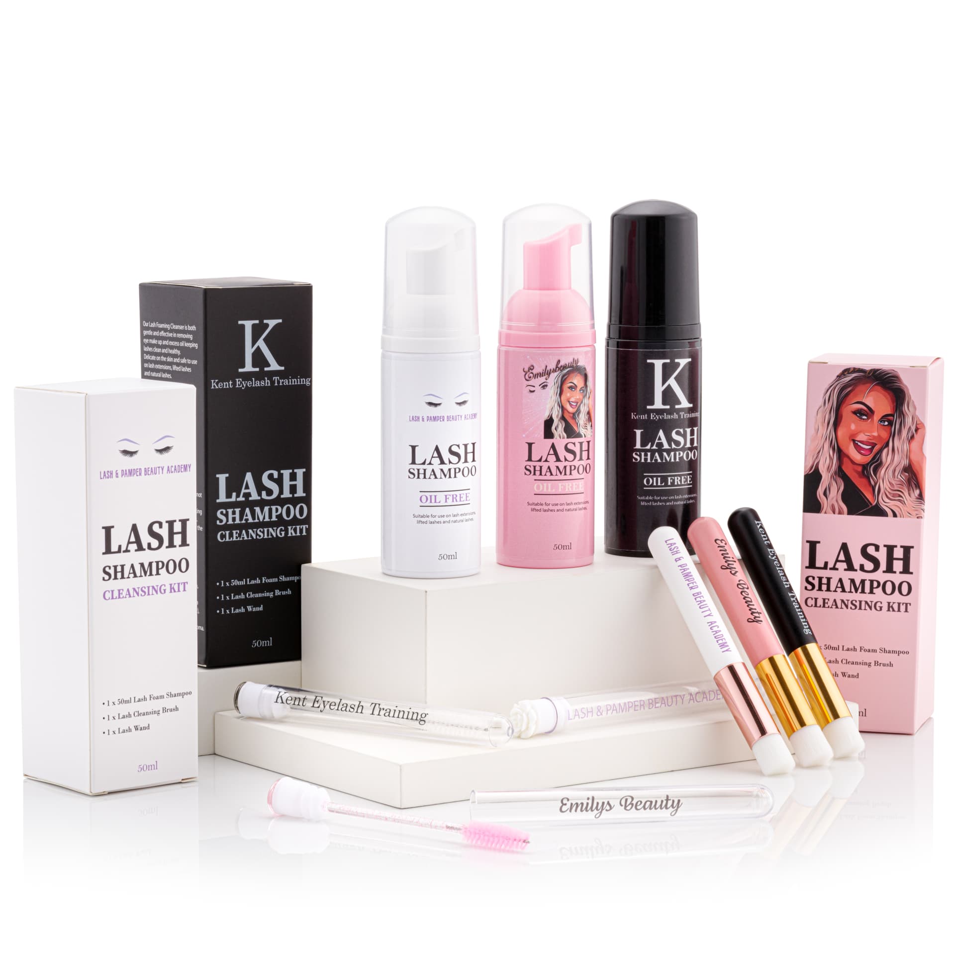
A plain product image tells you what is for sale. A lifestyle image gives it somewhere to belong. The interesting part is choosing a place that makes sense: a bathroom shelf, a bedside table, a kitchen counter. Each setting suggests a different use, even when the product stays the same.
PMP AI Studio includes a Lifestyle tool for exploring those settings from a product reference. This walkthrough uses existing demonstration images. It is a way to think through a brief, rather than a promise that every upload will produce the same result.
Start with the picture you already have
Open the source photograph at a useful size. Can you read the main label? Are the edges visible? Is the product complete, or does the crop hide part of it? A pleasing photograph is not always a helpful reference. Strong blur, glare across the name or a hand covering the closure can leave important details unclear.
Choose the clearest view that matches the angle you need. If the final scene depends on a feature hidden in that view, find another photograph showing it. Keep the original nearby while you review the output. Our source-photo guide covers preparation in more detail.

Give the setting a reason
Before describing the decor, finish this sentence: “The customer should understand that this product belongs…” The answer might be beside a washbasin, in a travel bag or on a dressing table. That gives you a stronger starting point than asking for a beautiful room.
The bathroom and bedroom examples here show how a setting changes the reading of an image. Look at the surfaces, surrounding objects and distance from the camera. Which parts help explain the product, and which are simply decoration? Use that distinction when deciding what to include in your own scene.

Write a brief you could hand to a photographer
A useful example: “Place the product upright on a pale bathroom shelf. Use soft window light from the left. Keep the label facing the camera, with a folded towel well behind it. Leave clear space on the right for a short headline.”
That brief names a position, light direction, supporting object and intended layout. It is an illustrative brief, not the recorded prompt behind the demonstration image. Replace the details with ones that suit your product. A heavy workshop tool needs a different setting from a small skincare bottle.
PMP’s built-in guidance can help develop a direction. Read a suggested change before applying it, particularly if it introduces another prop, a person or a new way of using the item. You are still deciding what the picture needs to say.
Change one decision at a time
If the room works but the product feels too small, adjust the framing. If the composition works but the mood is wrong, reconsider the light or materials. Changing the setting, camera position, palette and props together makes it harder to tell which choice helped.
Treat an image as a candidate for a specific use. Would it work as the second image on a product page? Is there room for the email headline? A scene can be attractive and still be the wrong shape or too busy for the placement you had in mind.

Check the product before choosing the picture
Compare the result with the source, starting with the label, closure, overall proportions and visible components. Then look at contact points. Does the product appear to sit on the shelf? Do shadows agree with the light? Have extra objects made the contents of the pack ambiguous?
View the image at the size a customer will see, then inspect the product more closely. Both views matter. Small text may be hard to judge in a thumbnail, while a composition that looks good enlarged can become confusing on a phone.
Keep the image that communicates the product clearly. If a detail needs careful finishing, ask the PMP studio about retouching or a new photograph. When you want a more expressive campaign set instead of an everyday setting, the next step is our Creative Studio brief guide.