Amazon A+ Content guide
A+ Content lets you add richer visual content below the fold on your Amazon listing. This guide covers what it is, what you need to prepare, which modules to start with, and how to avoid the most common mistakes. Whether you are planning your first A+ page or rethinking an existing one, the goal is the same: make the product easier to understand and the buying decision easier to make.
If you have started looking into A+ Content for your Amazon listings, you have probably already hit a wall of module names, image dimensions and options that feel impossible to make sense of quickly. It is one of those areas where the information is out there, but nobody quite explains what you actually need to prepare before you start building.
The good news is that it does not need to be complicated. Most brands do perfectly well with a handful of well-chosen modules and a clear set of images. The trick is knowing what to prioritise, what to leave for later, and what not to bother with at all.
This is a practical walkthrough of what you genuinely need. Not a list of every feature Amazon offers, but the things that actually matter when you sit down to plan your content.
What Amazon A+ Content actually is
A+ Content is the enhanced section that appears further down the product detail page, below the main image gallery and bullet points. It gives you space to add branded visuals, feature breakdowns, comparison charts and lifestyle imagery that the standard listing format does not support.
The important thing to understand is that it does not replace your gallery images or your bullet points. It supports them. Your gallery and title get the click. Your A+ section answers the questions that come next.
A lot of sellers confuse the different parts of a listing, so here is a quick breakdown:
Listing gallery images
The main image set at the top of the page. Up to nine images including your hero shot, angles, detail views and infographics. This is what gets the click from search.
A+ Content
The enhanced section below the fold. Uses structured modules with images and text to explain the product in more depth. Focuses on the individual product.
Brand Story
A separate carousel section that sits above A+ Content. It is shared across all your listings and introduces your brand rather than a specific product.
Premium A+
An upgraded version with interactive modules, video and larger layouts. Not available to everyone and not essential for most brands starting out.
Who can use A+ Content
A+ Content is available to sellers enrolled in Amazon Brand Registry and certain approved brand owners. If you are a brand registered seller, you can access the standard A+ Content builder through Seller Central.
Standard A+ is usually the starting point. It gives you access to the core module types, which is more than enough for a strong product page. Premium A+ is an upgraded tier with additional layout options, but it is not the default for every seller and you do not need it to build an effective page.
What you actually need before you start
This is where most sellers either overthink things or skip the preparation entirely. Before you open the A+ Content builder, there are four things worth having ready.
Strong product images
Clean product photography is the foundation. You need images that are consistent in style, well lit, and high enough resolution to look sharp across all module sizes. That includes clean product shots, detail close-ups, and lifestyle images where they add genuine context.
A+ Content is a visual format. If the photography is not strong, the modules will not work regardless of how well the layout is planned.
Clear product selling points
Before you choose modules, be clear about what makes this product worth buying. What problem does it solve? What are the top two or three benefits? What do buyers usually hesitate about? If you can answer those questions in plain English, you have the copy direction you need.
Basic brand direction
You do not need a full brand guidelines document, but you do need a sense of your visual identity. Colours, fonts if relevant, and a feel for whether your brand should come across as premium, natural, technical, playful or minimal. This keeps the A+ page feeling intentional rather than assembled.
A realistic page plan
Decide what modules you actually need and in what order. Not every available module needs to be used. A page with four well-planned sections will outperform one with eight modules that repeat themselves or add nothing new. Sketch it out before you build.
Before you build A+ Content, make sure you have
- Strong, consistent product images across all angles
- Clear benefits and selling points written in plain language
- A basic brand direction covering colours, tone and visual feel
- A simple layout plan with the module order mapped out
- A view on whether a comparison chart is genuinely useful for your range
What modules are usually most useful
Amazon offers a range of module types, but for most small and mid-sized brands, the following tend to do the heaviest lifting:
Branded header or opening image
Sets the visual tone immediately. A single strong banner image that introduces the product and brand in context.
Feature-led image and text modules
These pair a visual with a short explanation of a key benefit. One benefit per module keeps it focused and easy to read on mobile.
Comparison chart
Useful if you sell a range of related products. Helps buyers choose the right variant without leaving the page. Skip this if you only have one product.
Lifestyle or context image
Shows the product in a real or styled setting. Helps the buyer picture it in their life, which is something a white-background cut-out cannot do.
Brand Story
A carousel section introducing your brand. Worth adding if you have a clear story to tell, but not essential for every product at launch.
Using fewer modules well is almost always better than filling every available slot. Each section should answer a genuine buyer question. If it does not, leave it out.
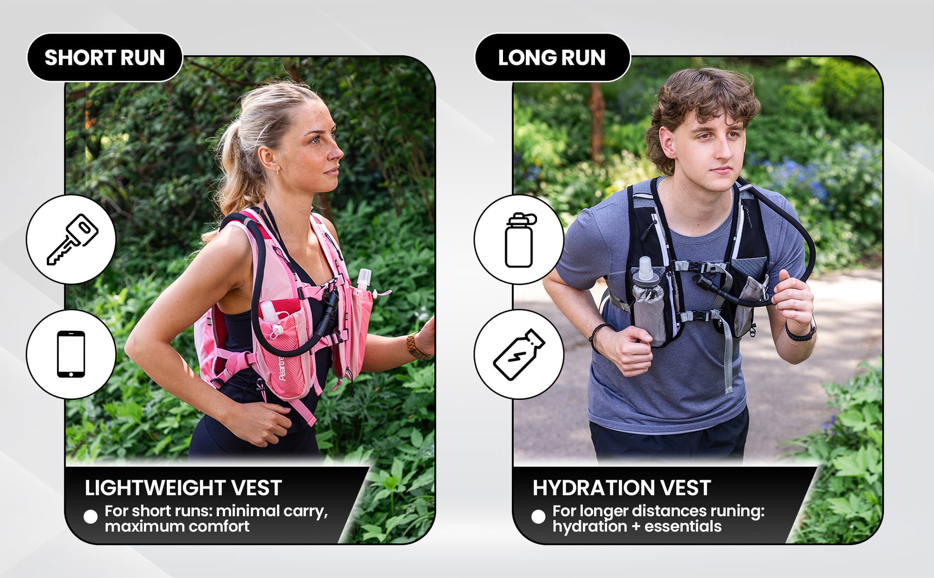
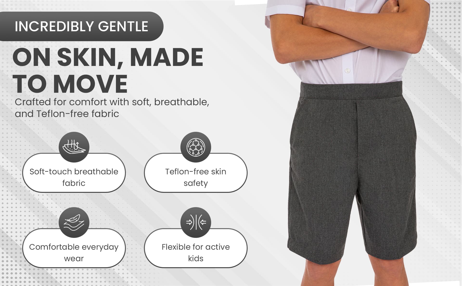
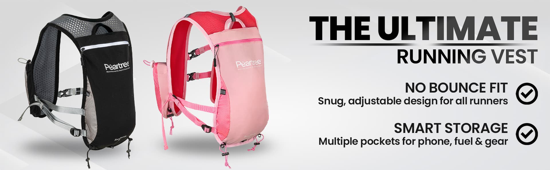
Real A+ module examples from our studio
A practical starter A+ structure
If you are building your first A+ page and want a reliable starting point, this layout works well for most product categories:
One branded opening section
A banner image that sets the tone. Keep it clean and on-brand.
One to two feature-led image modules
Each one explains a key benefit. Use a clear product image paired with a short paragraph.
One lifestyle or context module
Show the product in use. This adds depth and helps buyers connect with it.
One comparison chart (if you have a range)
Helps buyers choose between products. Only include this if you have genuine alternatives to compare.
Optional Brand Story
Add this if your brand story genuinely strengthens the listing. Leave it for later if you are unsure.
This is often enough for a strong first version. You can always add modules later once you see how the page performs and where buyers might still have questions.
What A+ modules look like in practice
These are real examples of A+ Content modules designed by our studio. Each page combines branded headers, feature blocks, comparison layouts and lifestyle imagery into a cohesive below-the-fold experience.
Modules built around product benefits
Each section answers a specific buyer question with clear visuals and concise text.
Branded headers, features and comparison charts
Banner images, feature grids, comparison layouts and lifestyle blocks all working together.
Designed as part of a complete listing system
Gallery images, infographics and A+ Content designed as one cohesive set.
Trusted by 250+ Amazon sellers and e-commerce brands across the UK


What kind of images work well in A+ Content
A+ Content should add visual depth that your gallery does not already provide. The most effective pages use images that serve a clear purpose rather than repeating the same product cut-out in every module.
- Feature-led visuals that highlight a specific benefit, material or design detail with callouts or overlay text.
- Lifestyle imagery that shows the product being used in a realistic setting, helping buyers imagine it in their own life.
- Detail crops that focus on texture, finish or quality indicators the hero image cannot show at full zoom.
- Infographic-style images that communicate size, specifications or comparisons visually rather than through blocks of text.
- Brand-led visuals that create consistency across your range and make the page feel considered rather than assembled.
Module tip
Each module should answer one clear question the buyer still has.
The point of A+ imagery is not to fill space. It is to answer the questions your gallery left unanswered. If the buyer can already see the product from every angle in the listing gallery, use the A+ section to show them something new: how it looks in context, how it compares to alternatives, or what makes it different from the next listing.
Amazon's own guidance repeatedly emphasises concise, mobile-friendly layouts and strong imagery over dense text. The pages that convert best tend to use fewer modules, each one focused on a single buyer concern, rather than trying to cover everything at once.
What should not go into A+ Content
Knowing what to leave out is just as important as knowing what to include. These are the issues we see most often in A+ pages that underperform or get flagged for rejection:
- Too much text. Large paragraphs do not read well on mobile, which is where most Amazon browsing happens. Keep copy short and let the images carry the message.
- Overly busy layouts. Cramming every available module type into one page creates visual noise. Buyers scroll past content that feels chaotic.
- Repeating gallery images. If the buyer has already seen an image above the fold, showing it again in the A+ section wastes the opportunity to add new information.
- Weak comparison charts. A chart where every product scores highly on every feature is not useful. If the comparison does not help the buyer choose, leave it out.
- Vague claims. Statements like "premium quality" or "best in class" without any supporting detail feel hollow and can trigger rejection.
- Content that risks rejection. Avoid pricing, promotional language, warranty claims or anything that contradicts Amazon's content policies. Keep claims specific and supportable.
Comparison-ready imagery
Consistent product photography across a range. When comparison modules use images from the same shoot, the page looks planned and professional.
Basic A+ vs Premium A+
Standard A+ Content gives you a solid set of module types including image-and-text blocks, feature lists, comparison charts and brand story sections. For most brands, this is more than enough to build an effective product page.
Standard A+
- Available to all Brand Registry sellers
- Image-and-text modules, comparison charts
- Brand Story carousel
- Mobile-friendly module layouts
- No additional cost to use
Premium A+
- Not available to all sellers
- Interactive modules and video support
- Larger image layouts and hotspot features
- Stronger visual impact when used well
- Best suited for established brands with rich content
Premium A+ is worth exploring once your standard content is performing well and you have the assets to support a more immersive layout. But it is not where most brands need to start.
What to prepare: a quick reference
| Asset or section | Why it matters | Essential or nice to have |
|---|---|---|
| Product photography | The visual foundation of every module. Weak images undermine everything else. | Essential |
| Lifestyle imagery | Adds real-world context and helps buyers connect with the product. | Essential for most categories |
| Feature-led text | Explains key benefits concisely. Pairs with images in the strongest modules. | Essential |
| Comparison chart | Helps buyers choose between variants or related products in a range. | Nice to have (essential if you sell a range) |
| Brand Story | Introduces your brand across all listings. Builds trust and recognition. | Nice to have |
| Premium modules | Interactive and video content for stronger visual impact. | Nice to have (not available to all sellers) |
A former buyer's perspective
Before I worked in product photography, I spent years buying products online for retail. And the thing that always stood out to me was not the listings with the most content, but the ones where I could understand the product quickly and feel confident about what I was getting.
The best A+ pages I come across today work the same way. They are not the busiest. They are not the ones with the most modules or the cleverest design. They are the ones that make the product easier to understand and make the buyer feel more certain about their decision.
That is the standard I would encourage any seller to aim for. Not bigger, not busier. Clearer.
A+ Content does not need to be bigger to work better. It needs to be clearer.
Claire Fulleylove, Creative Director
What we can help create for A+ Content
At Photograph My Product, we regularly create image assets designed specifically for A+ Content modules. That includes:
- Clean, consistent product photography across your range
- Lifestyle imagery styled to suit your brand and product category
- Infographic-style visuals with feature callouts and specifications
- Feature-led image assets sized for specific A+ module types
- Comparison-friendly photography shot to match across a product range
- Amazon-ready image systems where listing gallery, A+ Content and Brand Story all work together visually
We approach A+ imagery as part of a wider listing strategy. When your gallery images, infographics and A+ Content are all shot and designed as one set, the whole page feels more professional and more persuasive. You can see our full range of Amazon photography services or check pricing for a clearer idea of costs.
Branded banner module
A branded opening banner designed for an A+ Content header. Sets the tone for the rest of the page.
A+ Content works best when it makes the page clearer
The goal is not to fill every available module or create the most visually complex page you can manage. The goal is to give the buyer the information they need, presented clearly, so they can feel confident about buying.
That means good photography, concise copy, a sensible module structure and the discipline to leave out anything that does not genuinely help. A simpler page that answers the right questions will almost always outperform a busier page that answers the wrong ones.
If you are planning A+ Content for the first time, start with the checklist above, get your images and selling points together, and build from there. You do not need to do everything at once.
Ready to plan your A+ Content?
If you want help planning the right visuals for your A+ Content without overcomplicating the process, we are happy to talk it through. You can get in touch here or take a look at our Amazon photography services to see how we work.


