
Updated June 2026 with a new chapter on what happens when the sample changes the brief.
I have had a version of the same conversation more times than I can count. A client sends a beautiful lifestyle image of a chrome roller, a polished cufflink, a silver compact, a glossy bottle. The product is being held by a model, sitting on a kitchen counter, lit by a window, reflecting skin tones and a warm room. It looks stunning. Then we shoot it as a clean white-background packshot for their ecommerce listing, and the same product comes back looking calmer, more even, more “matte.” The follow-up email is almost always the same: where has the shine gone?
I am Nic, the studio director at Photograph My Product, and this article is the answer I wish I could send to every client the moment they ask. It is not a knowledge gap on their side, and it is not a mistake on ours. It is one of the most counter-intuitive parts of product photography, and once you understand the reason, it becomes a much easier conversation to have.
The honest truth
Shine is not really a property of the product. It is a property of what the product is reflecting.
Change the room, and you change the shine. That is why the same chrome can look glossy on a kitchen counter and calm on a clean white sweep, with no change to the product itself.
The cufflinks story
Fifteen years ago, when I first started, a client walked into the studio with a pair of polished silver cufflinks in his hand. He held them out to me and said, “I want them to look just like they do in my hand.” I said, “absolutely, no problem.”
Then I tried to make it happen on a pure white background, and I could not. Not the way he meant. The cufflinks looked clean, they looked accurate, they looked sharp, but they did not look the way they did in his hand. That afternoon was the moment I first understood what photographing a reflective product really is, and it has shaped the way I brief shiny products ever since.
This is more of a physics problem than a photography problem
When clients ask why a metallic surface can look so flat on white, the simplest honest answer is that it is more of a physics problem than a photography problem. A glossy surface does not generate shine. It reflects whatever is around it. What your eye reads as “shiny” is really high contrast between bright and dark areas on a curved surface, in quick succession. Strong highlight, deep shadow, strong highlight again. That contrast is what makes a metal feel alive.
On a pure white background, in a clean studio environment, there is almost nothing dark for the product to reflect. Highlights and shadows on the metal compress towards each other. The chrome looks even and clean. Your brain reads that evenness as “flat,” even though the surface itself has not changed at all.
The mirror analogy
The clearest way I have found to explain this is the mirror analogy. A truly reflective product is, for our purposes, a small mirror. If you put a mirror flat on a table and photograph it straight down, what does the camera see? It sees the camera, the photographer, the ceiling and the studio lights. So the first job is always to stop the product from reflecting all of that.
The way we stop it is by surrounding the product with white cards, scrims and diffusion. The product now reflects controlled white surfaces instead of the camera and the room. That solves one problem, but it creates another: the product is now reflecting almost entirely white, so the surface looks calmer than it did in real life, where it was reflecting your skin, the floor, and the dark patches of the room.

Same finish, different room
The lifestyle shot looks glossier because the product is reflecting a richer, darker world.
The same chrome roller, sitting on a marble counter under a window, has dozens of dark and light areas to reflect: skin, hair, fabric, shadow, the edge of the worktop, the phone next to it. All of that contrast is reflected back into the curves of the product, and that is what reads as gloss.
Lift that same product onto a clean white sweep, and most of those reflections disappear. The product has not changed. The room around it has.
Lifestyle shots show more shine because the product is surrounded by skin tones, shadows and richer colours.
The same finish on white
A pure white packshot is built for clarity and trust on a product page. It will always look calmer than a lifestyle shot of the same product, because there is nothing dark for the surface to reflect.
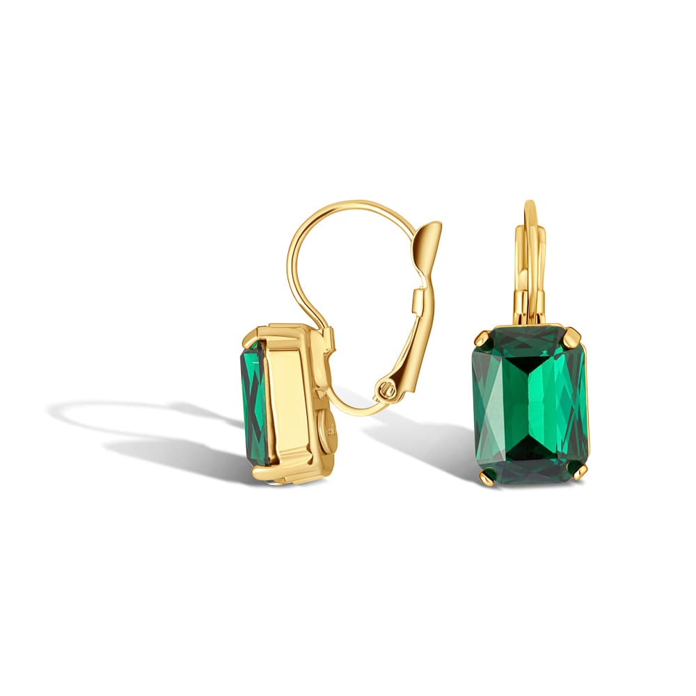
Why flat-on shapes are harder than rounded ones
The shape of the product matters as much as the surface. A rounded or curved object naturally picks up alternating dark and light stripes around its edge as the light wraps around it. Even on white, those stripes give the eye something to read as gloss. Think of a wedding ring, a perfume bottle, or the curved shell of a watch case.
A flat-on, straight-faced reflective product is much more like a mirror. There is less curvature for the light to wrap around, so less natural variation in the highlights. If a brief calls for a straight-on PR or catalogue angle, the shine has further to come back from in retouching, because the shape is not helping us. Sometimes a small change of angle, even a few degrees, is enough to give the surface what it needs to feel glossy. Sometimes the brief genuinely requires straight-on, and then we lean harder on lighting and post.
And the eye is not telling you the whole truth either
There is a quiet second factor at work. Human vision can see a much wider range of brightness, in a single glance, than any screen can display. When you hold a polished product in your hand, your eye is doing real work to balance the brilliant highlights against the deep shadows. By the time that scene becomes a JPEG on a product page, sized down for ecommerce, a lot of that range has been compressed into something a phone or a laptop can show.
That is not anyone’s fault. It is just the difference between the eye and the camera. It is also another reason a product can feel slightly less alive on screen than it did in your hand, even when nothing has gone wrong with the photography.
What we actually do in the studio to put shine back
All of the above is the why. The more useful part is what we do about it. There is a real toolkit we use to give a reflective product its character back on white, and most of it is invisible in the final image.
- Black flags and dark cards. Just outside the frame, we place strips of black card or fabric so the product has something dark to reflect. That brings back contrast on the curves without making the background dirty.
- Gradient sweeps and tented light. Instead of lighting the product in a pure white tent, we shape the light so it falls off gently from bright to slightly darker. The surface picks up that gradient and reads as glossy rather than even.
- Two-shot compositing. For the toughest products, we will shoot one exposure with a clean, controlled white reflection that keeps the body of the product looking clean, and a second exposure with less white and more dark reflection that gives back the glossy edge. Then we blend the best of both in retouching.
- Retouching. Rebuilt highlight rolls, deepened reflection edges, controlled rectangle reflections so they read as a window rather than a softbox, and a painted shadow under the product. None of this is fixing a bad shot. It is the normal craft of retouching reflective surfaces.
- Edge definition. A small, refined dark edge can be deliberately added to separate chrome or silver from a pure white background. It has to be subtle. Done well it feels premium and product-led; done heavily it tips into cartoon, which is the opposite of what we want.
The honest caveat is that even with every tool above, a true marketplace-compliant pure-white packshot will always be calmer than a lifestyle shot of the same item. That is a feature for ecommerce, not a bug: a clean, consistent white image builds trust on a product page and reads quickly on a category grid. It is doing a different job to a hero banner.

The studio toolkit
Black flags, gradient lighting, two-shot compositing and careful retouching. None of it is visible in the final image, all of it is doing work.
With reflective products, we are not just photographing the object. We are photographing the room it can see.
Nic, Studio Director
When more shine is not actually the goal
It is worth saying this clearly, because it surprises people: maximum shine is not always the right brief. I had a conversation recently with a client who deliberately specified matte ferrules and a slightly lighter wood across his range, because his product is engraved. When you engrave a highly polished surface, the engraved lines read as dark patches and the surrounding metal picks up bright reflections. As the product rotates under the light, parts of the engraving disappear into glare or shadow. Less shine, in his case, made the detail sing.
The same logic applies to background choice. Pure white is the right answer for marketplace listings and many ecommerce category pages. Premium and luxury items often look stronger on a pale cream, a soft grey, a black, or a subtle reflective surface like Perspex, because those surroundings give the product something more interesting to reflect. The background is part of the finish, not just styling. We will often recommend a small set of test shots so a client can see their product on pure white and on an alternative surface before committing to a full range.

Match the surface to the finish
Off-white, light grey, black and gentle reflective surfaces can read more premium than blanket pure white, especially for high-end metallic products.
When the sample changes the brief
There is one more honest thing worth saying about reflective products, because it sits at the centre of a lot of the quietly difficult conversations we have at the studio. The quote we send before a sample arrives is always our best guess. It is based on a description, a reference image and a category. We use those inputs to put the project into a pricing tier, and most of the time we get it right first time.
Reflective products are the category where we sometimes do not. A description that reads as “a glossy roller on white” can arrive in the post as something genuinely more complex. A multi-metal shell with engraving on a polished face. A natural stone set into a chrome frame. A clear bottle with a foil label that catches the light differently from every angle. None of those products are unphotographable. They just need a different retouching tier than a flat reflective packshot does, and the line item in the original quote will not always have stretched to it.
Reflective products are scope-sensitive in a way matte products are not. The quote that arrives before the sample is always a best guess. The honest conversation that happens after the sample is what protects the result.
Claire, Creative Director
When this happens, we try to do two things well. The first is to flag it the moment we see it, rather than after several rounds of revision. The longer a scope mismatch sits unspoken, the harder it gets to talk about later. The second is to talk the brand owner through their options in plain words. That might be an adjusted plan with the right retouching tier built in. It might be a smaller scope that still gets to a strong result. It might be pausing the project and resetting the brief together. None of those conversations are comfortable, but all of them are better than shipping work that does not represent the product or the studio.
We share this because the most useful thing we can publish about reflective products is not we always get it right. It is here is what we do when we do not, and here is how to spot it as a brand owner so the conversation can happen sooner. If your product is reflective and you have any sense that the sample may be more complex than the description, say so up front. Send an iPhone photo. Mention the engraving, the mixed materials, the foil, the stone. It changes the quote in your favour, and it makes the project calmer for everyone.
How to brief a shiny product so you get what you want
The best results come from a clear conversation up front, so a quick checklist before any reflective shoot:
- Send a reference of the finish you want to see, ideally an in-hand or lifestyle image, so we know what 'shiny enough' means to you.
- Be honest with yourself about the priority: clean and ecommerce-ready, or premium and glossy. They pull in opposite directions and the lighting choices follow from that.
- Tell us whether straight-on shape accuracy matters more than angled shine. PR images and packaging often need flat-on; campaign images can usually find a more flattering angle.
- Plan for at least one lifestyle or styled angle alongside white packshots so the gloss has somewhere to live.
- Consider whether off-white, pale grey, black, Perspex or a subtle reflective surface might suit the material better than pure white.
- Flag specific reflections you want removed or reshaped, especially rectangle softbox shapes, hands, logos and unwanted catch-lights.
- Tell us which details have to remain readable, especially engraving, brand marks, grain and fine ridges. Sometimes the answer is less shine, not more.
- Allow proper retouching time on metallics. The work is real and most of it is invisible in the final image.
- Share the budget range you have in mind. Reflective and engraved products are scope-sensitive, and quoting the right tier before samples arrive is much easier when we know what range you are working in.
- Send an iPhone reference of the actual sample if you can, especially for multi-metal forms, mixed finishes, foil labels, engraved polished surfaces or natural stone inserts. It changes the quote in your favour and avoids surprises after the box is opened.
How feedback works on reflective products
Reflection notes after the first proof are not a redo. They are part of the normal feedback loop on metallic and glossy products, and we expect them. Here is how the conversation usually flows:
First proof
We send the cleanest version of the packshot, true to the white-background brief, with controlled reflections in place.
Reflection notes
You tell us where you want more or less gloss, which reflections feel wrong, and whether the edge feels too soft or too defined.
Targeted retouch
We deepen reflections, refine the edge, reshape rectangle softbox marks, rebuild highlight rolls and adjust the contrast on the surface.
Happy medium
The goal is rarely to make the white packshot identical to the lifestyle shot. It is to find the balance between clean ecommerce and enough contrast to communicate the real character of the product.
What we are really photographing
The most useful question on a reflective shoot is not “can we make it shinier?” It is “what do we need this image to communicate?” Clean ecommerce trust. Premium gloss and desire. Readable engraving. Accurate shape for packaging or PR. Campaign atmosphere. Each of those answers leads to a different lighting choice, a different background and a different retouching plan. None of them is wrong. They are just doing different jobs.
That is why we will often suggest a mix on bigger projects: clean white packshots for product listings and marketplaces, an alternative surface or two for premium category pages, and one or two lifestyle frames where the product can really show its gloss. You can read more about how we think about this in our notes on packshot vs lifestyle product photography, and on the specific challenges of jewellery photography.
Have a reflective or metallic product to shoot?
Send us a sample image of the finish you want to see and a short list of products. We will come back with a clear approach, a recommendation on white versus an alternative surface, and a quote. If it is a difficult finish, we will usually suggest a small set of test shots before committing to a full range.
